
Wednesday, 9 May 2012
Tuesday, 24 April 2012
Feedback from my teacher (24 April 2012)
Thanks to my teacher, I got to see what my finished product would look like on paper and the feed back she gave me was:
- Front cover and contents page was good
- My double page spread needed smaller text as the text was too big
- As my text got smaller i would need to add more text to make it look like a double spread
Friday, 23 March 2012


Barcode
 |
| When I saw this barcode I loved it becasue it was different from the barcodes I usually see and it followed the code and conventions so I adapted an idea from this barcode |
 |
| This is my barcode, I didnt want to copy it exacly but adapt something |


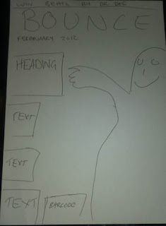
Plan for new front cover, contents page and double page spread
Below are my rough sketches of what my final pieces were going to look like.


First draft and feedback

Above is the feedback I got for my first draft. Most of the feedback was good but just a few negative feedback comments:
- "It looks gd. and like the pictures BUT the only think dont like is the colours. think the red and blue clash"
- "Not feeling the colour scheme... Loving the title... "Bounce"... . Xx"
After reading this feedback I decided to change the:
Images
Colour scheme
Contents page and front cover
Background on my contents page
Wednesday, 21 March 2012
Colour palette

This is my colour palette:

Masthead design
For my masthead I used the font 'Super Black SF' and when i was designing my masthead I wanted something funky, a good effect that will catch the audience eye. i wanted an effect that relates with the title so I decided to add a bouncing ball on the text and I though it would look best on the o.
 |
| I decided to crop the bouncing ball in the image and use as the bounce on my masthead and I had some help from a teacher from my school by the name Mr Jamie Wallis |
 |
| When i put it together it came out like this. |
New pictures


 |
| Deleting the background was difficult as the background was difficult as the background was the same colour as the jacket. |
I decided to take new pictures not only becasue I had misplaced my USB, but becasue the first images I took had no backdrop which made it difficult to manipulate the images on photshop.
These are some of the new images I took:
 |
| Deleting the background on this image was easir as the backdrop was not the same colour as the jacket. |


Wednesday, 29 February 2012
29/02/12 Update
After review and feedback in lesson I now know the aspects of my front cover, double page spread and contents page that I need to improve. I need to:
- Change the colours on my front cover and double page
- Improve the background of my double page spread
- Change/ take new pictures for my front cover
- Re-think through the colours on my double page spread
Wednesday, 8 February 2012
Masthead Fonts
Below are some masthead front I researched and thought of using for my front cover, contents page and double page spread.Bounce

In the end i chose the masthead above and I was influenced by the masthead below. I tried to to do something similar to that.

Wednesday, 1 February 2012
1st of February 2012 update
In today's lesson i was was working on keeping my blogg and work up to date and also sorting out my layout for my magazine front cover, contents page and double page spread. I had already done sketches of al three of these things but just needed to then draft onto my final piece.
Picture taking
On Friday the 27th of January I took some images for my front cover, contents page and double page spread. The reason why they weren't taken in a photo studio was because the room i had planned to use for my photo shot was being used and its the the only photo studio in my school. More pictures will be taken at a later date.


Thursday, 26 January 2012
Plan and update
For my final piece I will need to design a front cover, contents page and
double page spread related to my chosen genre and target audience I specified in my music magazine research.
From the 25th to the 26th I will be doing my final planning and layout for my front cover, contents page and my contents page. I've taken one day on my schedule to take pictures and work through my weekend to produce my final designs. Feedback is good and that's why I'm spending 4 days on feedback and improvements and my final presentation will be on Friday the 3rd of February 2012.
Below is a schedule which I'm going to follow to finish my final product.

Tuesday, 24 January 2012


Friday, 13 January 2012
Christmas Assignment
During my christmas half term holiday I was assigned to research a music magazine of my choice and the music magazine I chose was Vibe. The reason why I chose Vibe is because Vibe is a magazine which I can relate and it has a wide fan base especially people in their late teens and early 20's.
Vibe is a music and entertainment magazine founded by Quincy Jones. The publication predominantly features R&B and hip-hop music artists, actors and other entertainers. After shutting down production in Summer 2009, Vibe was purchased by the private equity investment fund InterMedia Partners and is now issued quarterly with double covers, with a larger online presence, aided by the Vibe LifeStyle Network, a group of entertainment/music websites under the Vibe brand. The magazine's target demographic is predominantly young, urban followers of hip-hop culture. The magazine owed its success to featuring a broader range of interests than its closest competitors The Source and XXL which focus more narrowly on rap music, or the rock & pop-centric Rolling Stone and Spin.

The cover above is a Vibe front cover and a you can see it focuses on Kanye West and his career. We know the cover is focusing on the truth and his career and this is emphasised by the sub heading on the left hand side of the cover and also he colours used. The use of the various colours also symbolise Kanye's career as he has not onl been a rapper but he as sung some songs and the colours emphasise how he has explored the music world. Just like any other magazine the front cover doesnt just focus on on issues, the other issues are on the right hand side of the page. The reason why i think Vibe used a close up portrait was to portray the message behind the focus of the cover and its message as it was about Kanye West, the truth and his career, the colours symbolises his career and the image symbolises the truth and the masthead symbolised who and what Kanye currently is and this matches with the collar on his jacket.

This is the contents page for Vibe magazine, as can be seen the small masthead is ‘contents’ and it’s designed in a way that would make the readers think this magazine is unique, and it’s positioned at the far left of the page the font which is used is bold black San Serif which shows it’s modernized and sticking to the house style as the rest of the contents page is also in black and grey with a hint of red in the main image. There are two sub-headings sharing the feautres of the contents page, these two sub-headings are ‘Features and Fashion’. This almost turns the contents page into a list, so it’s easier for the reader to navigate around and the page numbers are just said as numbers. The sub-headings however are in the font of Sans, which shows that it’s more tradditional but also adds the aspect of elegance and softness to the contents page.
The main part of the contents is the feature part because it’s highlighting all the articles that will be shown in the magazine and there is also additional information underneath the sub-headings to drip feed to the reader what it’s going to be about and to intrigue them. The main part of the contents page would be the image which is Kanye West a good choice because he is known world wide and popular also, the image is set on a background of a big ‘V’ which is a good, elegant way to keep reinforcing to the reader that they are reading vibe magazine. Once again the image is ineracting with the reader as he’s looking towards the camera. Also the outfit that Kanye is wearing shows that he’s smart and represents his take on Hip-hop, his outfit and it’s colours are kept the the house style, so it’s all smooth and fits well together. The use of red is shown by the heart that is in the hand of the arm that’s reaching out. The image is also captioned to show whose photographed it, and to give full rights to the photographers.
My research has given me a heads up on a couple of things about designing magazine front covers and contets page. From my research i now know how to keep a consistent house style and mantain that for which ever project I am doing. I also got some photography tips and masthead designing tips because from watching this good work i have developed my skills as this great work has influeneced me.
Based on my research I have decided to design a magazine and contents page for a hip hop and rnb magazine. I got the idea from Vibe magazine and also because based my research on Vibe and i think my cover will go well as i know quite a lot of information hip hop and rnb. My knowledge on hip hop and rnb will not only help me on designing a great cover,but also how to make it appeal to the target audience.
The purpose of this magazine is updating the public onthe latest hip hop and rnb news, gossip etc. Research shows that most magazine readers buy magazine with exciting news, big headlines and gossip and i think that will also make my cover succesful.
Research shows that most hip hop and rnb fans are middle class teenagers and people in their early 20's. Just like hip hop and rnb, my magazine will have the same target audience and will target hip hop fans in their teens and early 20's. This will affect how i design thia cover because i want something eyecatching, something that will attract the target audience. Research shows that my target audience are attracted by colours that have a consistent house style, bright colours, mid shot camera shots and also like covers with a bit of nude as this is in some hip hop and rnb music videos.
Title ideas

After doing some reseach i had to come up with a title for my magazine and i decided to call it Bounce. Above is an image of the ideas i came up with for the magazine title. The three titles which i liked the most were Bounce, Trend and Flava. I got these ideas by looking at hip hop and rnb quotes, evidence is below.

Subscribe to:
Comments (Atom)