Friday, 23 March 2012


Barcode
 |
| When I saw this barcode I loved it becasue it was different from the barcodes I usually see and it followed the code and conventions so I adapted an idea from this barcode |
 |
| This is my barcode, I didnt want to copy it exacly but adapt something |


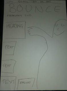
Plan for new front cover, contents page and double page spread
Below are my rough sketches of what my final pieces were going to look like.


First draft and feedback

Above is the feedback I got for my first draft. Most of the feedback was good but just a few negative feedback comments:
- "It looks gd. and like the pictures BUT the only think dont like is the colours. think the red and blue clash"
- "Not feeling the colour scheme... Loving the title... "Bounce"... . Xx"
After reading this feedback I decided to change the:
Images
Colour scheme
Contents page and front cover
Background on my contents page
Wednesday, 21 March 2012
Colour palette

This is my colour palette:

Masthead design
For my masthead I used the font 'Super Black SF' and when i was designing my masthead I wanted something funky, a good effect that will catch the audience eye. i wanted an effect that relates with the title so I decided to add a bouncing ball on the text and I though it would look best on the o.
 |
| I decided to crop the bouncing ball in the image and use as the bounce on my masthead and I had some help from a teacher from my school by the name Mr Jamie Wallis |
 |
| When i put it together it came out like this. |
New pictures


 |
| Deleting the background was difficult as the background was difficult as the background was the same colour as the jacket. |
I decided to take new pictures not only becasue I had misplaced my USB, but becasue the first images I took had no backdrop which made it difficult to manipulate the images on photshop.
These are some of the new images I took:
 |
| Deleting the background on this image was easir as the backdrop was not the same colour as the jacket. |


Subscribe to:
Comments (Atom)